

Over the weekend, I’ve been experimenting a little more with my rose petal pigments, and have branched out in my designs to include leaves and birds. I’m really happy with the results. Take a look below!

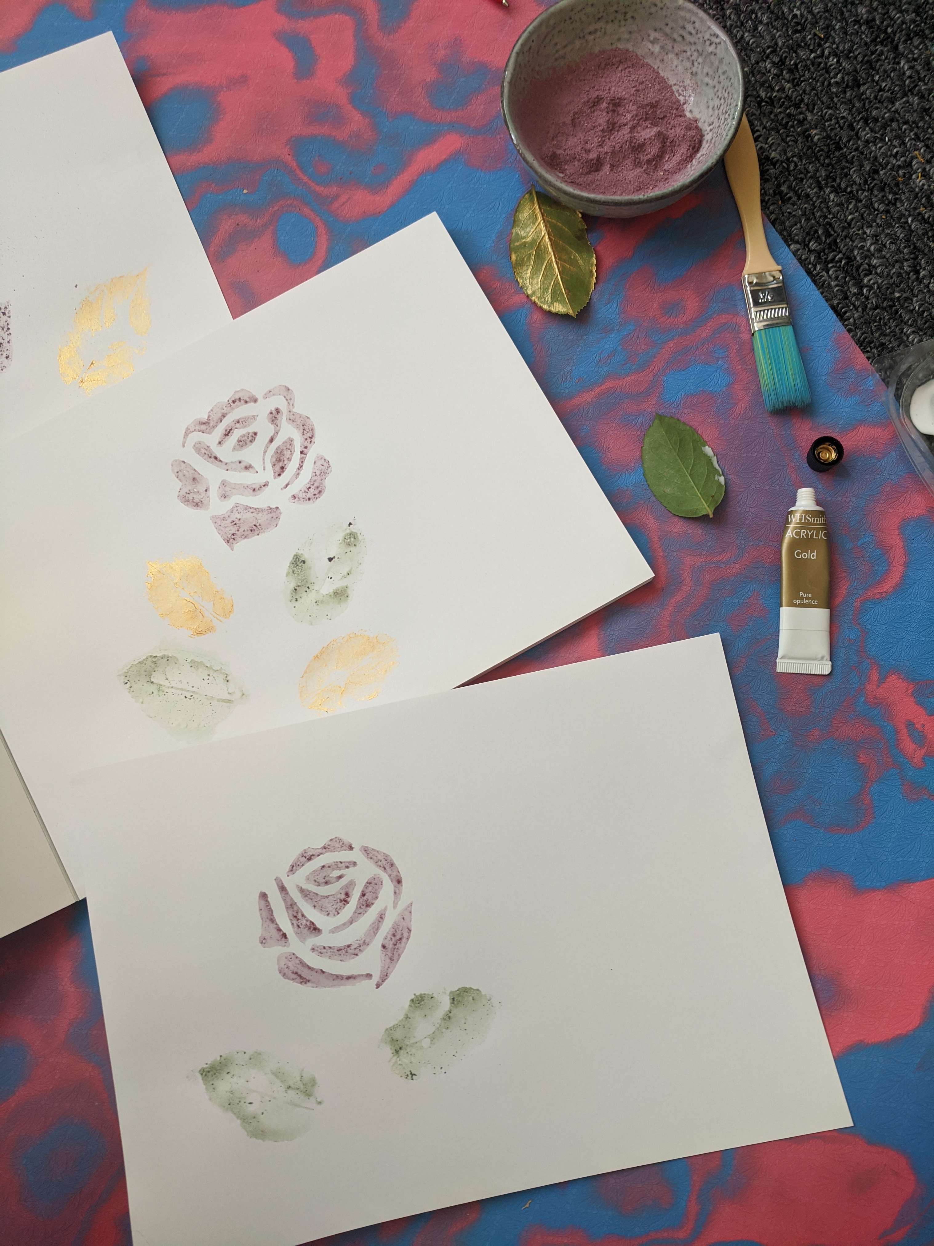
One of my main concerns with using this pigment was that the purple colour would fade over time. I have noticed that these paintings have become a little browner in tone, but they’re lasting pretty well. The main thing I love about using this paint is the texture! The pigment doesn’t dissolve particularly well in water, so the paint is a little grainy, but I feel that really adds something to the designs.
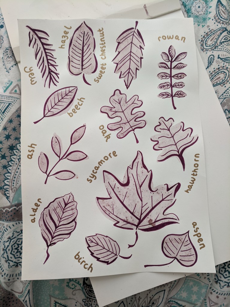
I began by painting the obvious — roses. I took inspiration from the canal folk art roses which decorate narrowboats, which you can read more about here. I used purple and gold pens to outline the shapes. I then changed my subject matter to leaves, painting rough shapes from different native British trees. Again I used the purple pen to outline the shapes, giving them more definition. I like the effect created when the pen overlaps the paint, or doesn’t quite match the edges: it gives it a more modern feel.


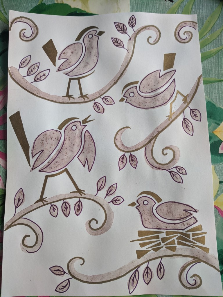
Moving away from plants altogether, I began painting stylised bird designs. While I coloured the larger parts with the pigment paint, I added other details with metallic pens. The pigment here was a little browner: I don’t know if it was mixed with too much water, or that it had steeped for a little too long. I tried again by mixing the pigment in a little less water, so the mixture was more concentrated, and it worked out better for the next painting.
I took the bird pattern and played around with different poses and positions, including putting one in a nest! To fill out the page I added tendrils and branches, as well as some leaves (although, being much smaller, I couldn’t give them the same detail as those above). Using reference pictures of different British garden bird species, I adapted the simple design to create the shape of different types of birds. I managed six altogether — a goldcrest (using the metallic pen to give it the distinctive head marking!), a goldfinch, a wren (recognisable for his upright tail), a long-tailed tit, a robin, and a blue tit. I tried using different colour pens to outline each bird, to see how each colour would match with the pigment.

What do you think I should experiment with painting next? I would like to try some more bird species — maybe some birds of prey, or coastal birds. Or I could move away from animals altogether, and try different objects or landscapes! Stay tuned!

Hi Nellie, loving your technique, it has a graphic quality like a woodcut. What next? Landscapes and trees, but wildlife is always good, perhaps fish and crustaceans would work well in this style
LikeLike
Thanks Phil! Sea life is a fantastic idea, especially appropriate in these summer months! I’ll have a go at that next weekend 🙂
LikeLike